

A vernacular type in NYC.
Uma tipografia Vernacular em Nova Iorque.
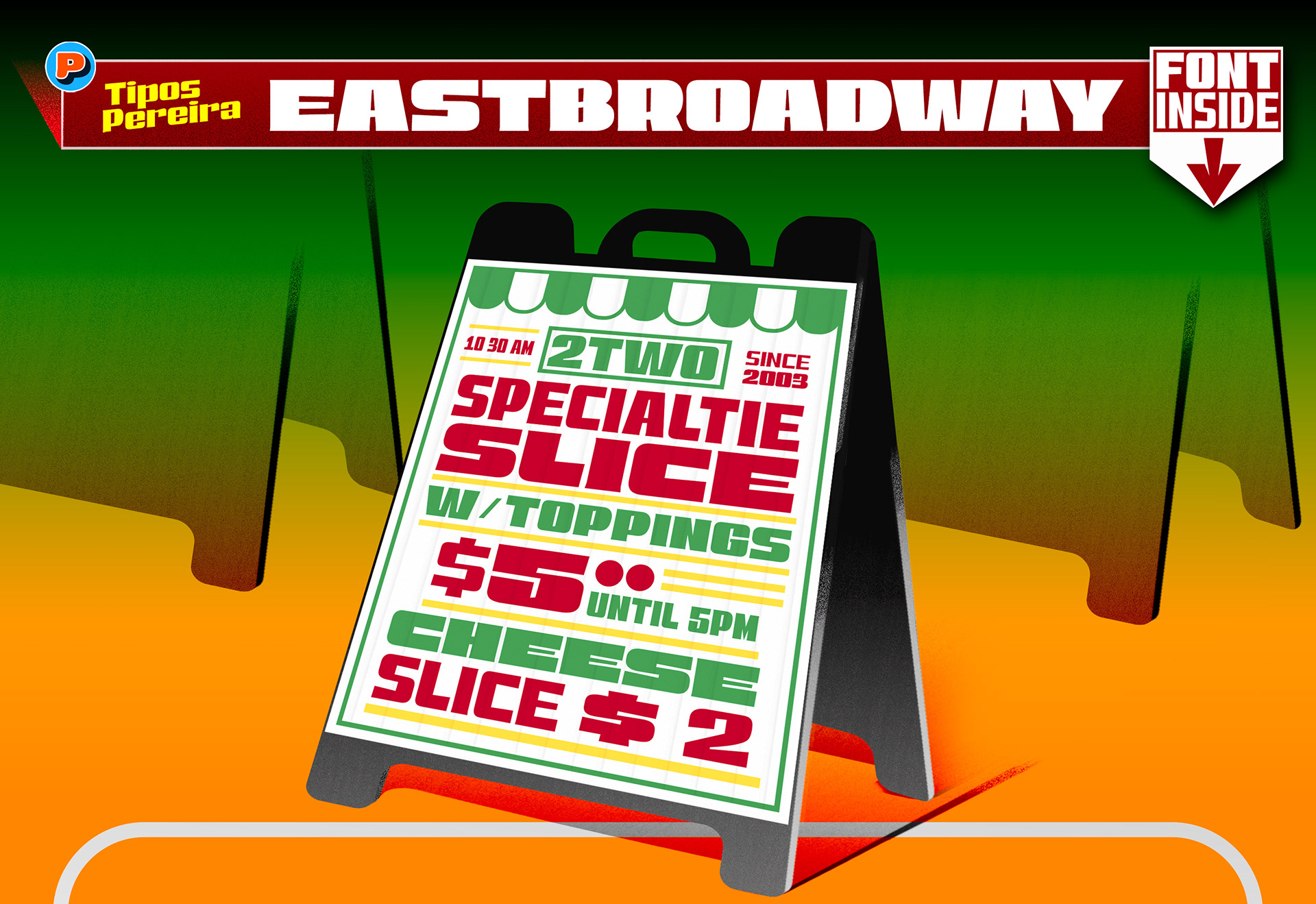
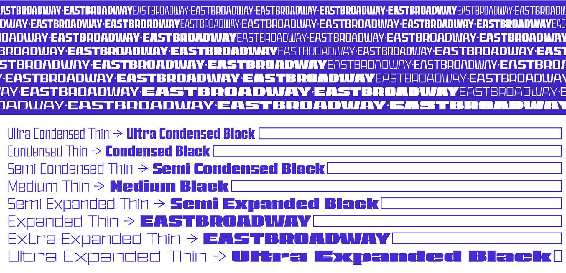
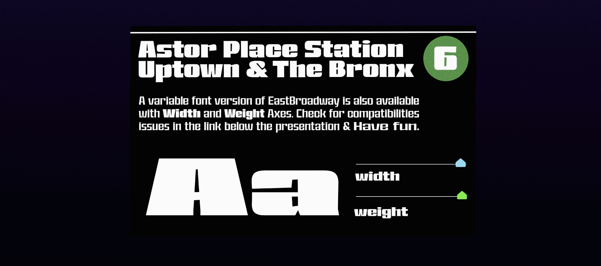
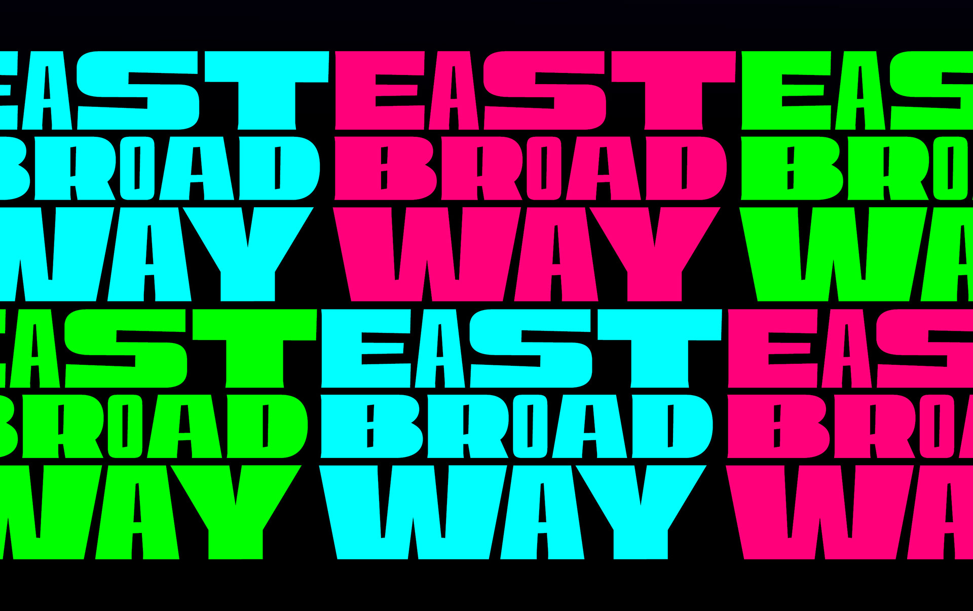
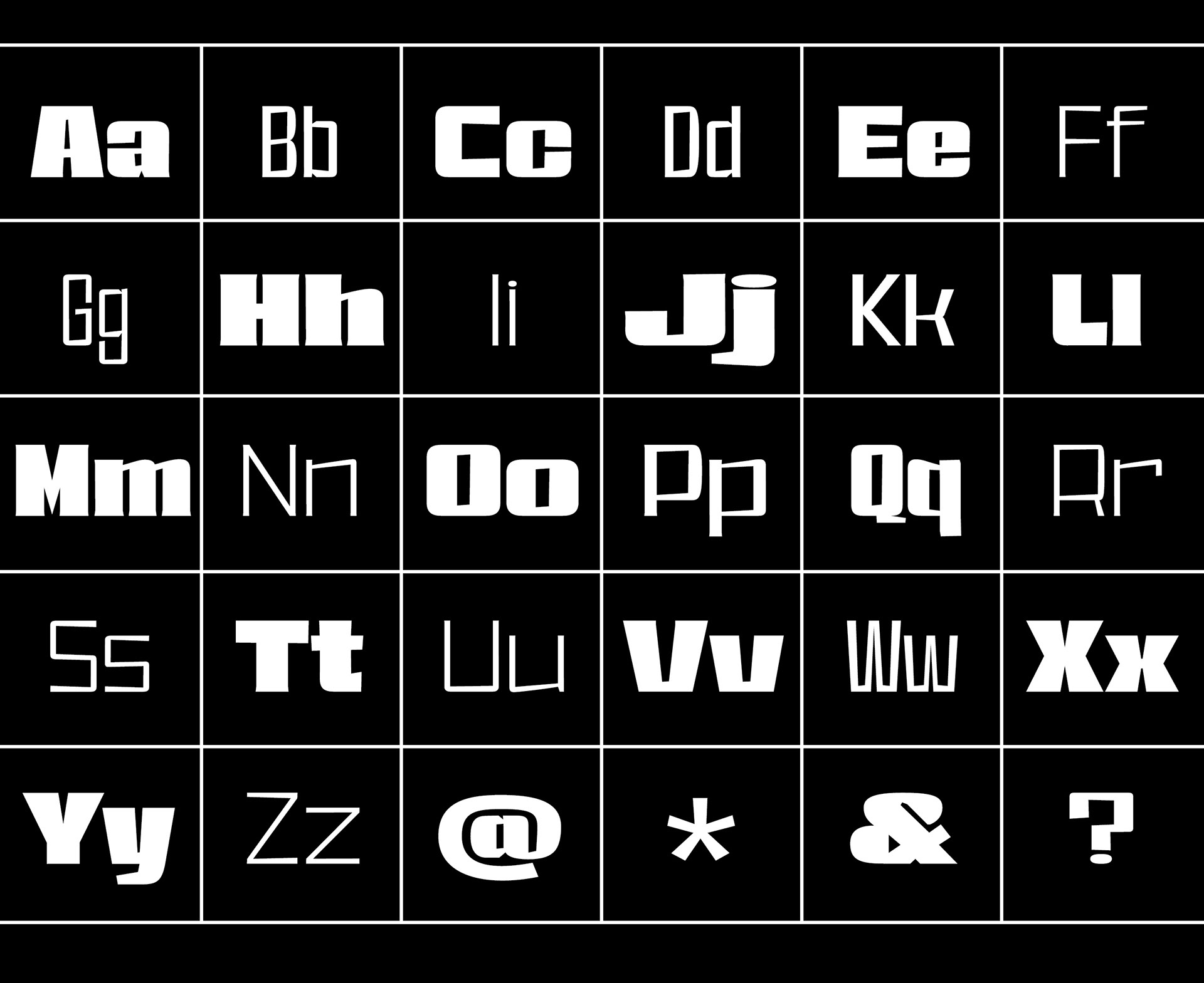
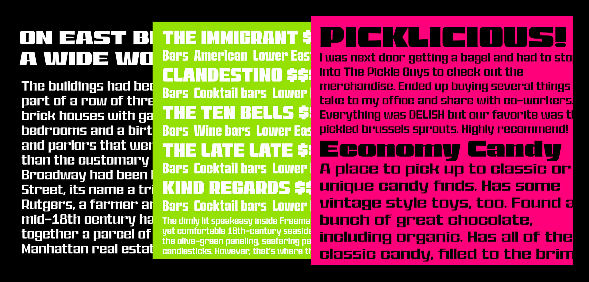
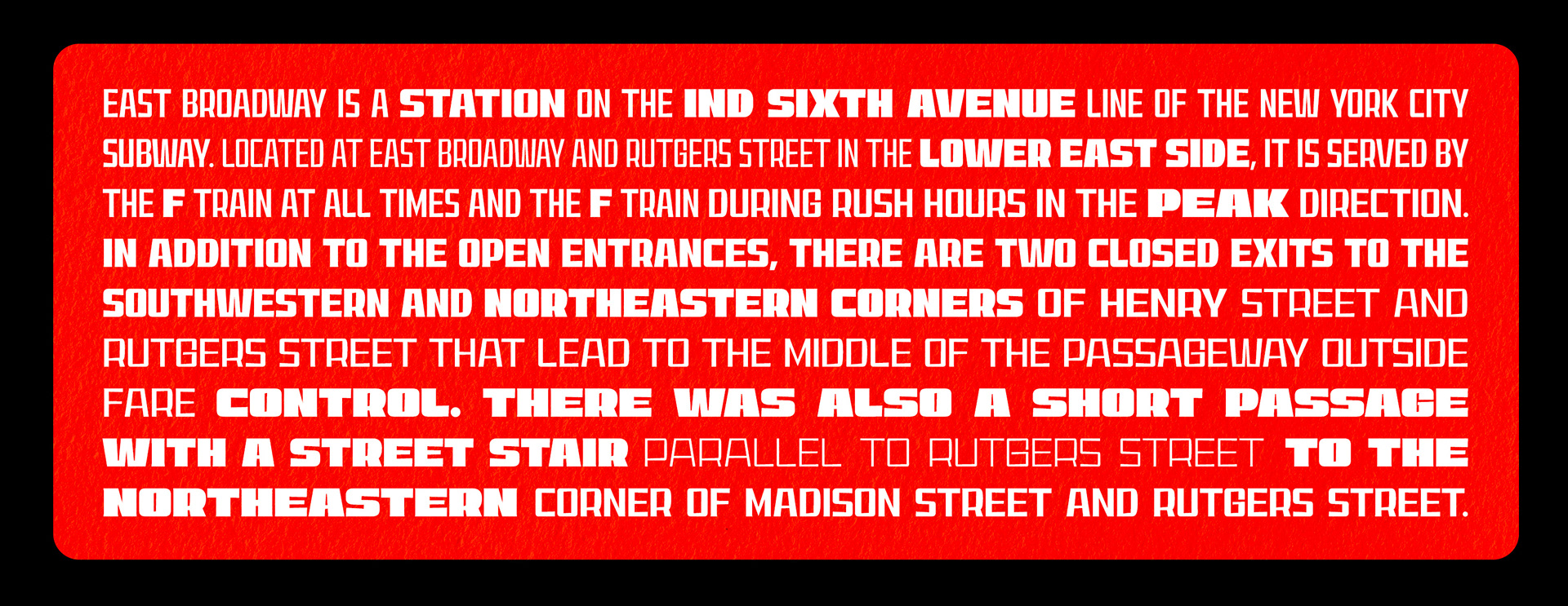
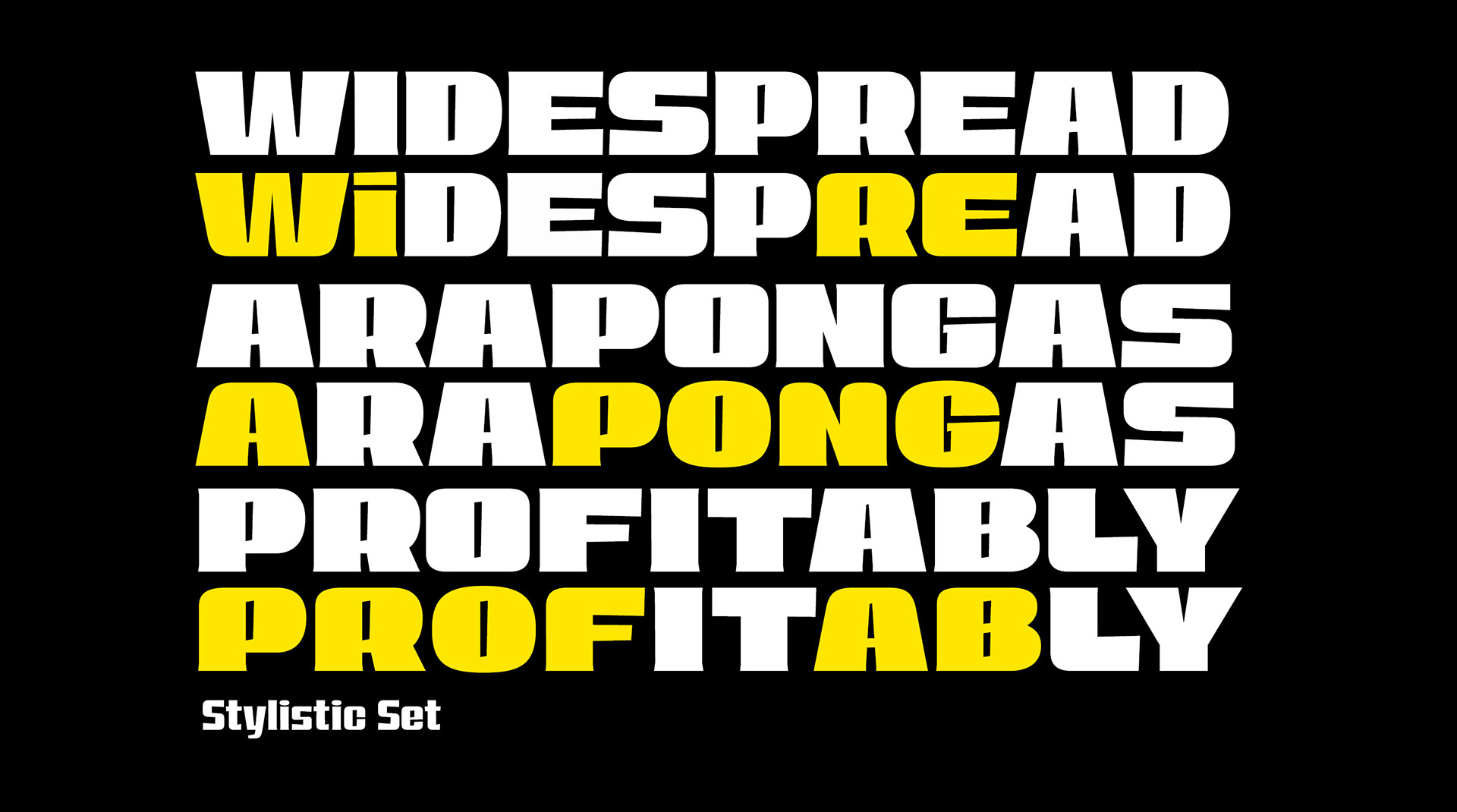
English. The EastBroadway typography draws from vinyl cut letters found in the Lower East Side neighborhood, from the EastBroadway subway station to 13th Street and 1st Avenue in New York. A clash between an improvised craft to elaborate fast and low budget signs with a 40 weights type family + 1 variable font with weight and width axes, everything you need to make any word fit in your layout.
Português. A tipografia EastBroadway tem sua origem nas letras recortadas em vinil encontradas na região do Lower East Side, partindo da estação de metrô EastBroadway até a Rua 13 com 1a Avenida em Nova Iorque. O encontro de uma técnica improvisada para fabricar sinalizações rápidas e baratas com uma família tipográfica de 40 pesos + 1 fonte variável com eixos de peso e largura, tudo que você precisa pra “fazer caber” qualquer palavra no seu layout.
EastBroadway is a vernacular typeface inspired by true events.
Available on • CREATIVE MARKET • MYFONTS • YWFT • 🔜 T-26


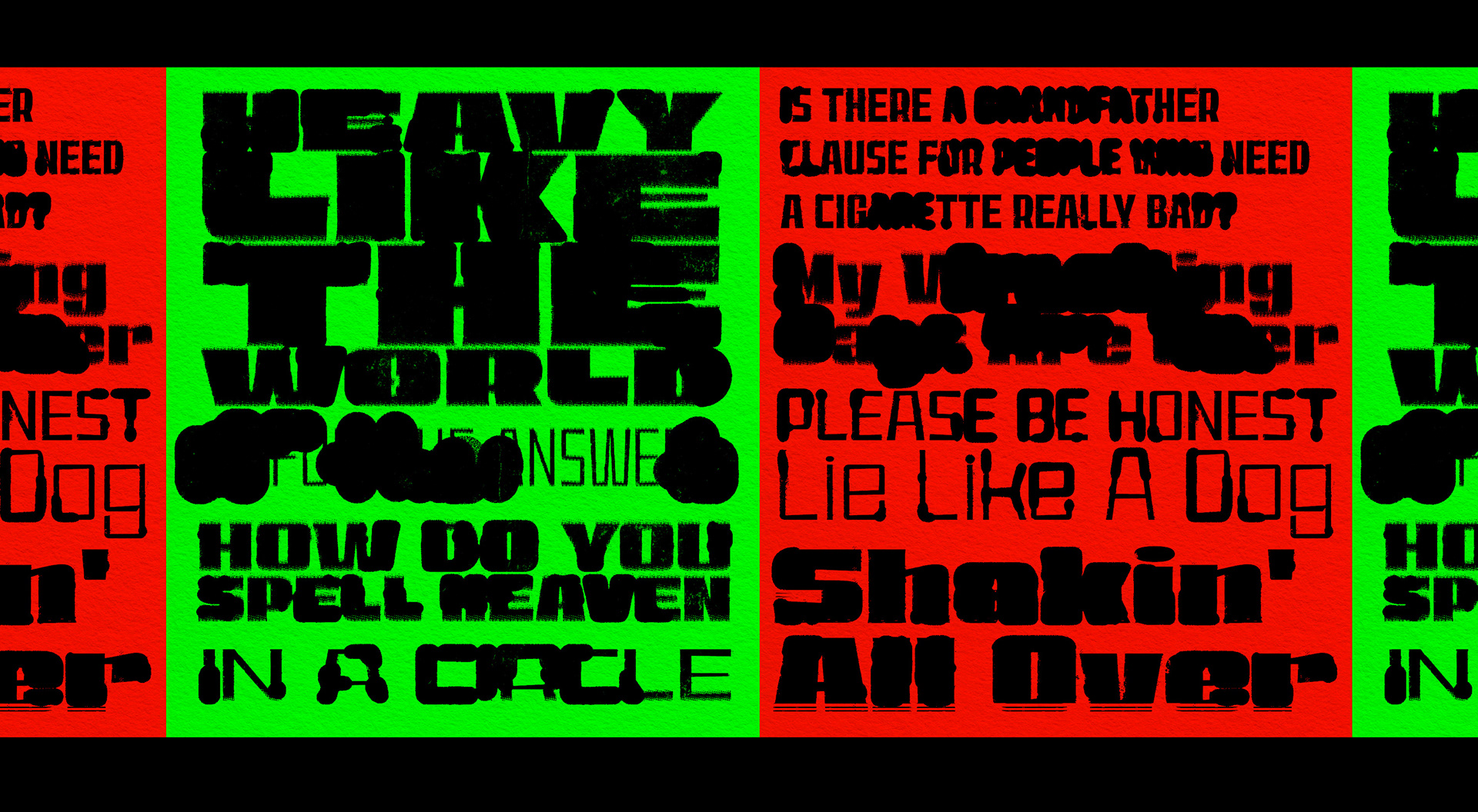
⬇️ This is EastBroadway with a lot of photoshop effects, it's not a Grunge font ;)⬇️
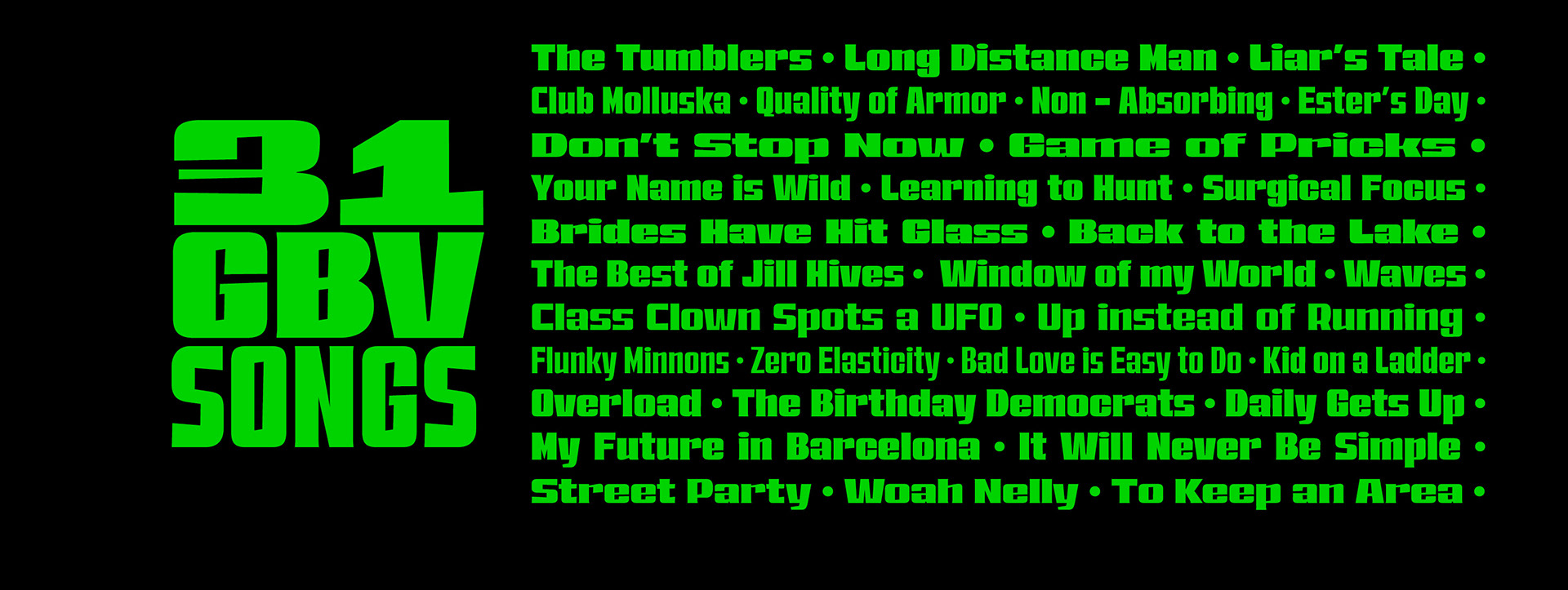
☠️ I just wanted to create some orange and green posters with GBV song titles ☠️
EastBroadway is a vernacular typeface inspired by true events.
Available on • CREATIVE MARKET • MYFONTS • YWFT • 🔜 T-26

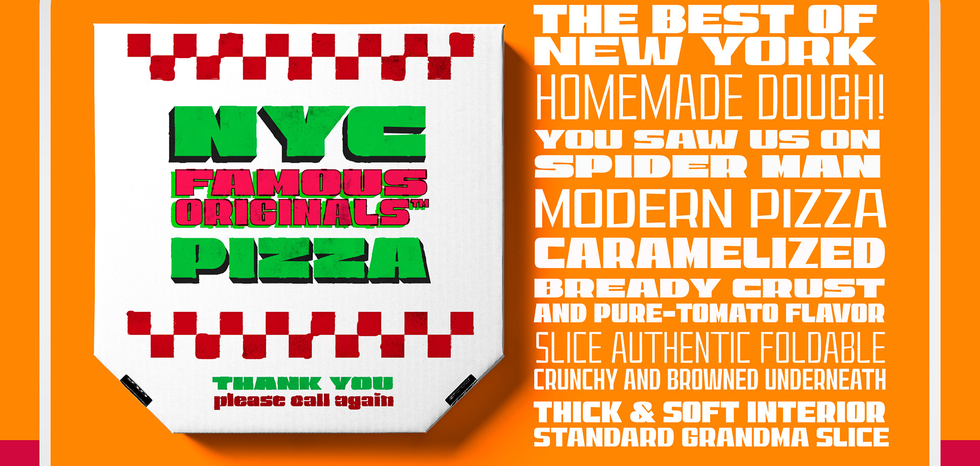
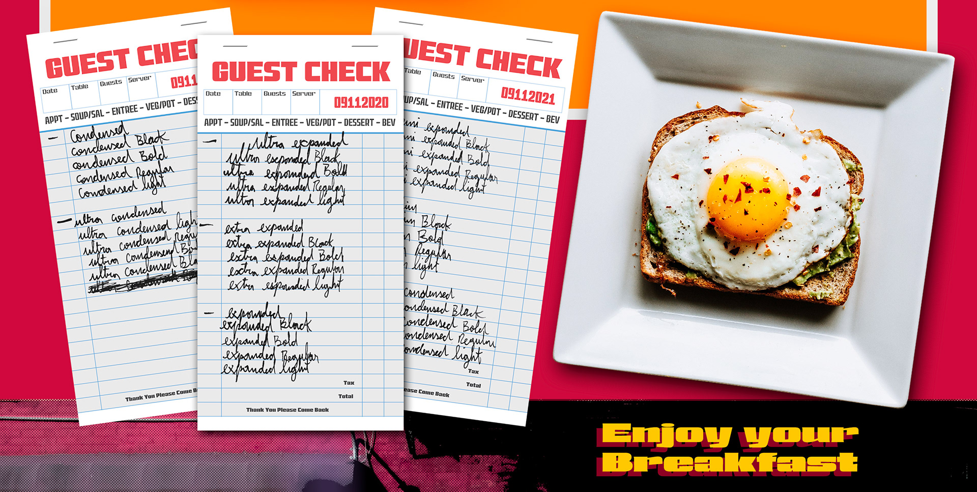
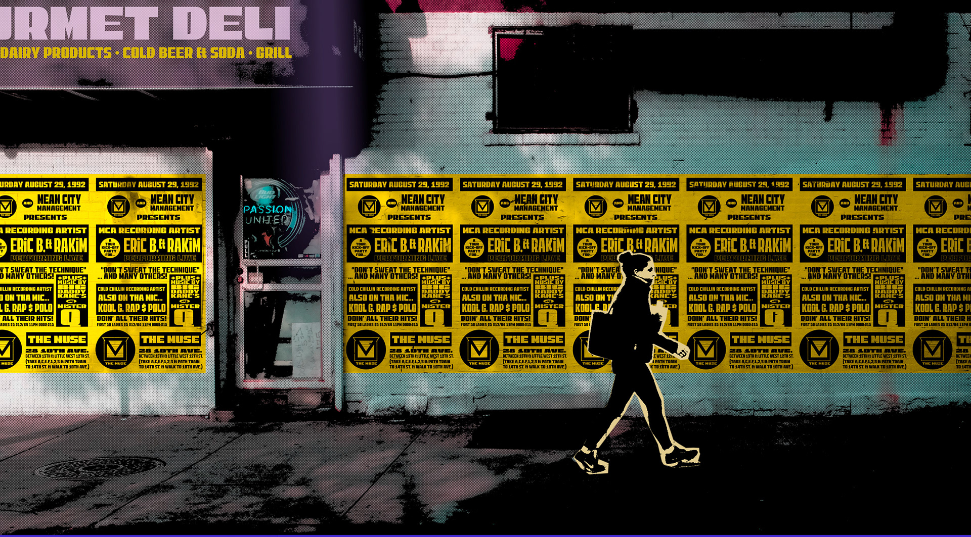
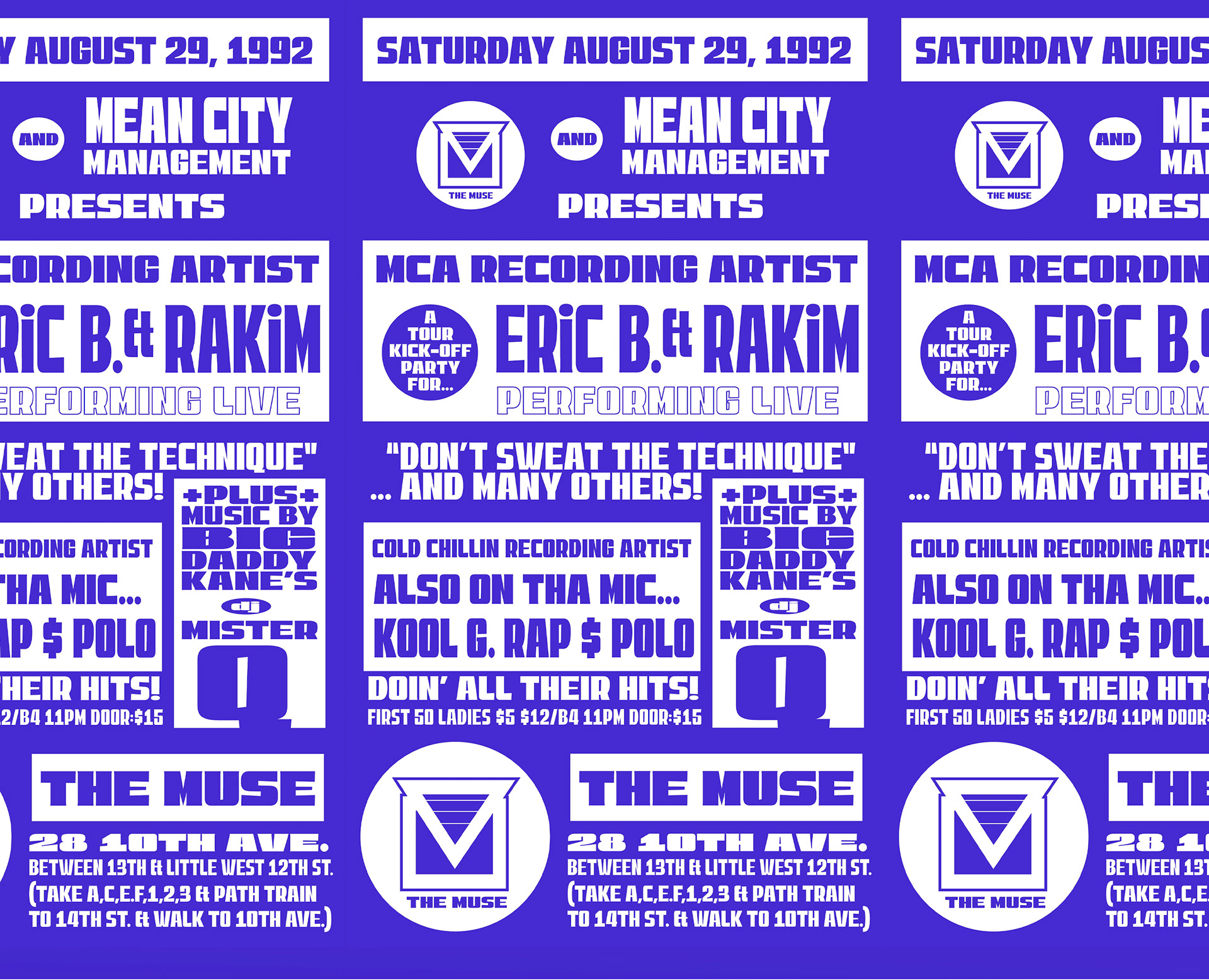
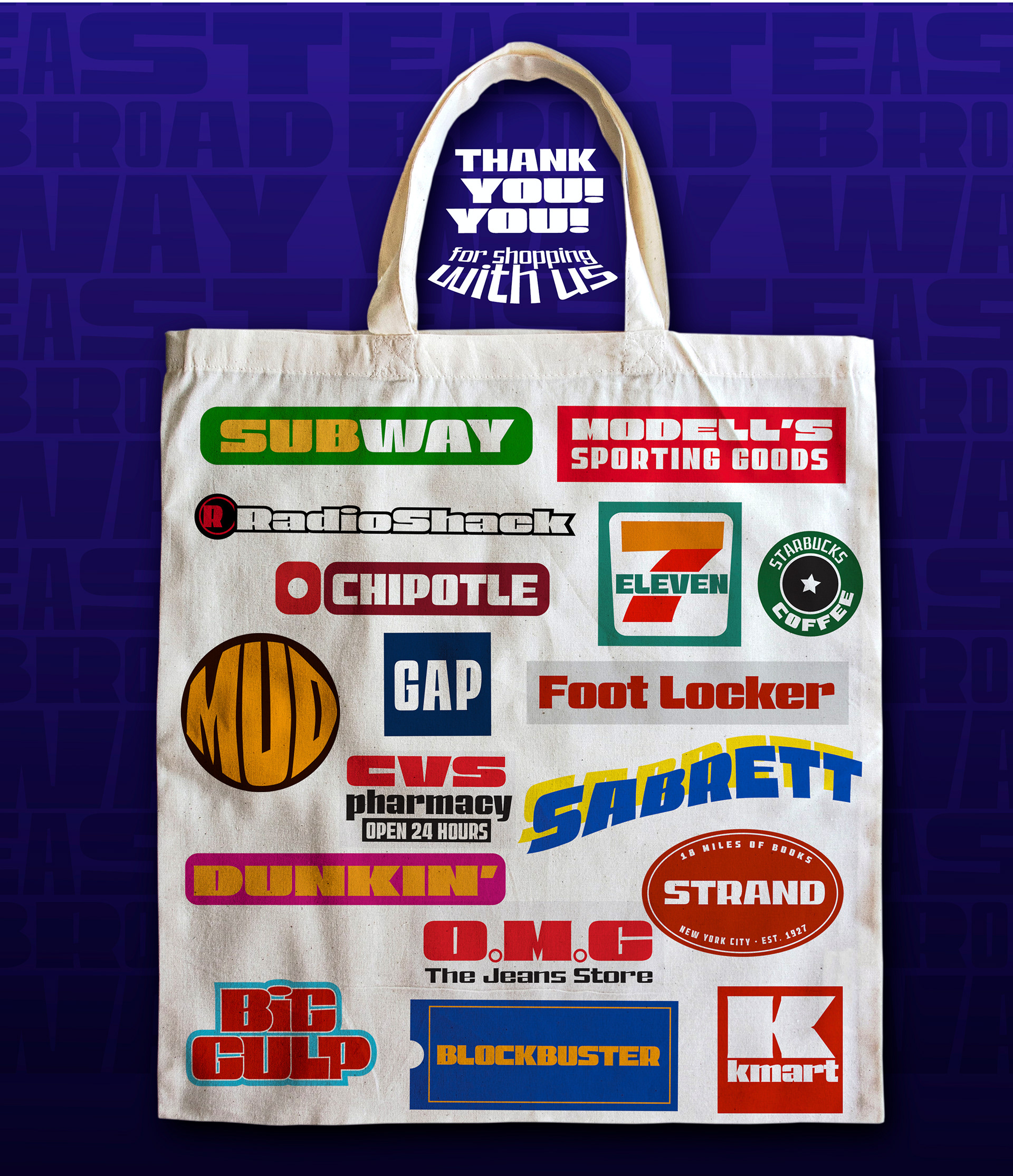
Thanks to Ben Kolde for sharing their work on Unsplash, most especially that delicious egg yolk pic and thanx Mr Mockup 🤪 for the Pizza Box. I also liked to thanks Stretch Armstrong for his Medium article on the book "No Sleep: NYC Nightlife Flyers 1988 to 1999" such an amazing and inspiring research and from which I took a model of the flyer THE MUSE for reproduction here, keeping all original information and design, just changing the original typeface for EastBroadway. Thanks for everyone who shared DrawBot codes for animations of variable fonts on Github and in the DrawBot website, I worked hard to make some Gifs with street names and subway stations of NYC.
🖖